Initials
|
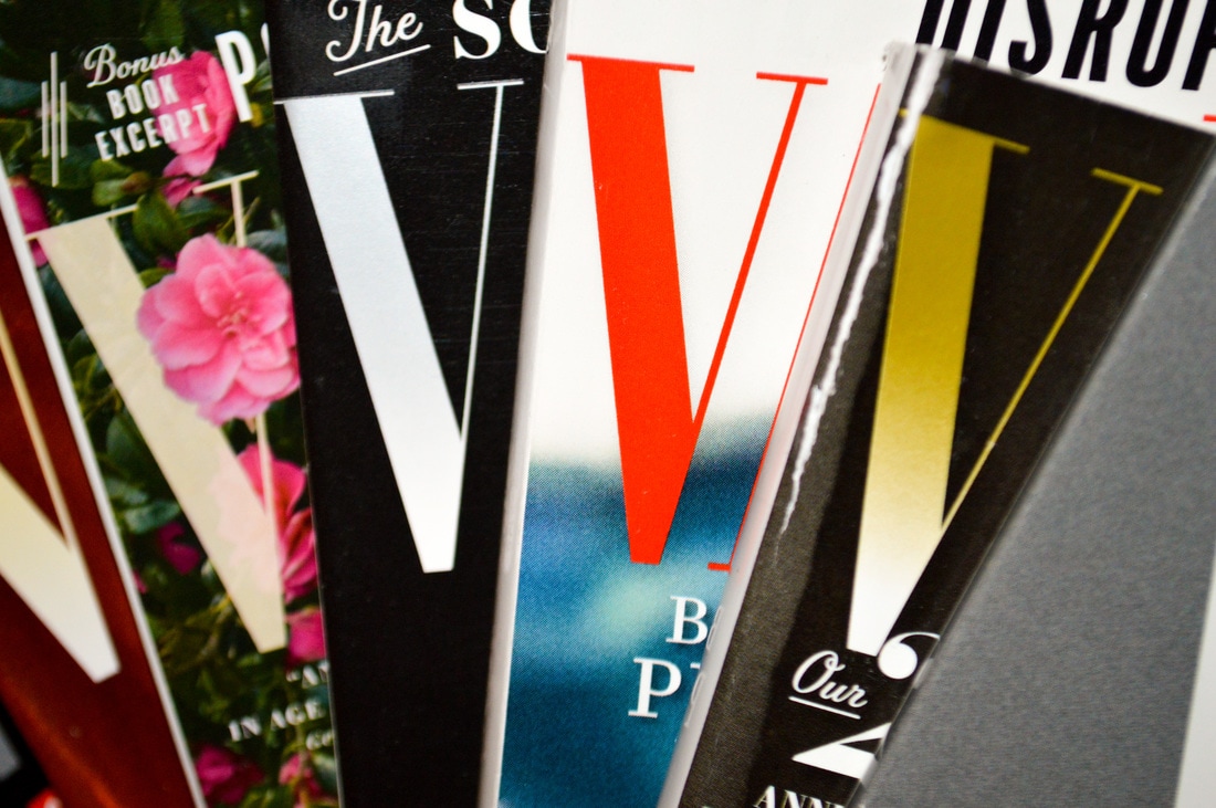
This photograph of Vogue Magazines is one of my favourites because each V stands out from one another. Each V shows something different that the other V's don't show, making them all unique and stand out. The multiple letter V's can represent how my family is so big and how each branch of the Villavecer's are different in each way. I turned up the contrast of the red V to help make it stand out, as red is the first colour to catch the eye; helping show the main subject in this photograph. I turned up the whites and turned down the black to increase the contrast between the V's and the backgrounds.
|
|
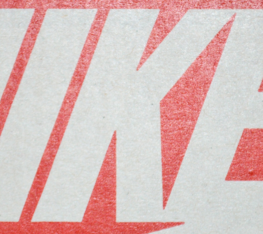
I chose this photograph of a Nike shoe box to represent the sporty side of me. Almost all of my life, I've grown up around basketball, and even though I may not have wanted to play when I was younger, I love the sport now. I turned up the whites to make the K stand out compared to the orange background. I patched some black dots on the K to keep the same consistent look throughout the letter.
|
|
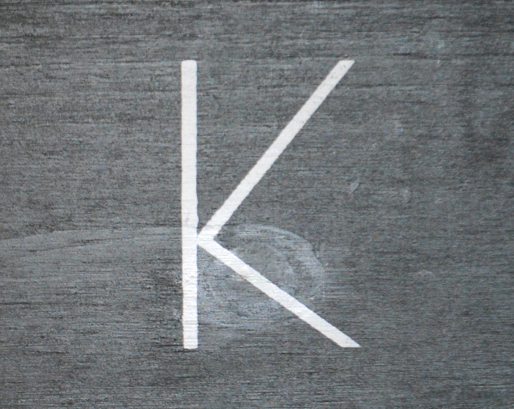
This K stands out on the grey wood because I decided to then again, turn up the whites and lower the blacks. I patched many spots on the wood--subtly to make it look smooth throughout the background--by using the patch tool on Lightroom. I like the wood look on the background to bring out a raw look and feel to the photograph.
|
Hands
|
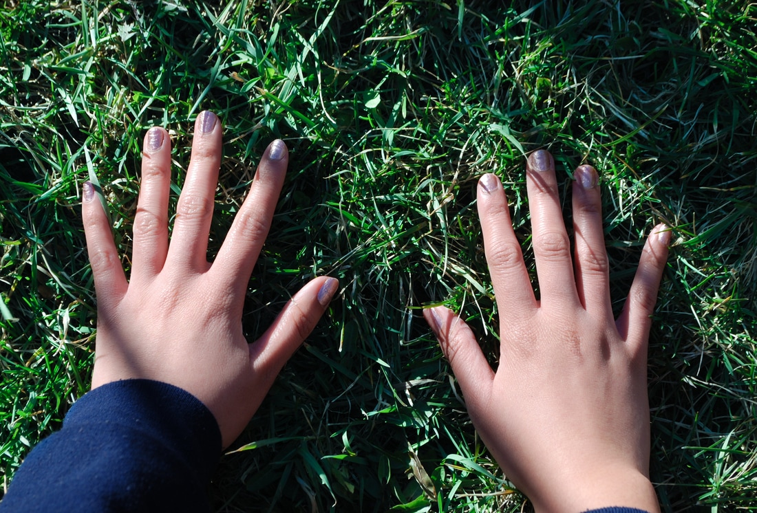
To bring out the contrast of her hands to the grass, I used the brush tool to tint the grass to make it more green. I also brought up the saturation of the grass. I also brought up the clarity to help bring out the texture in the grass.
|
|
|
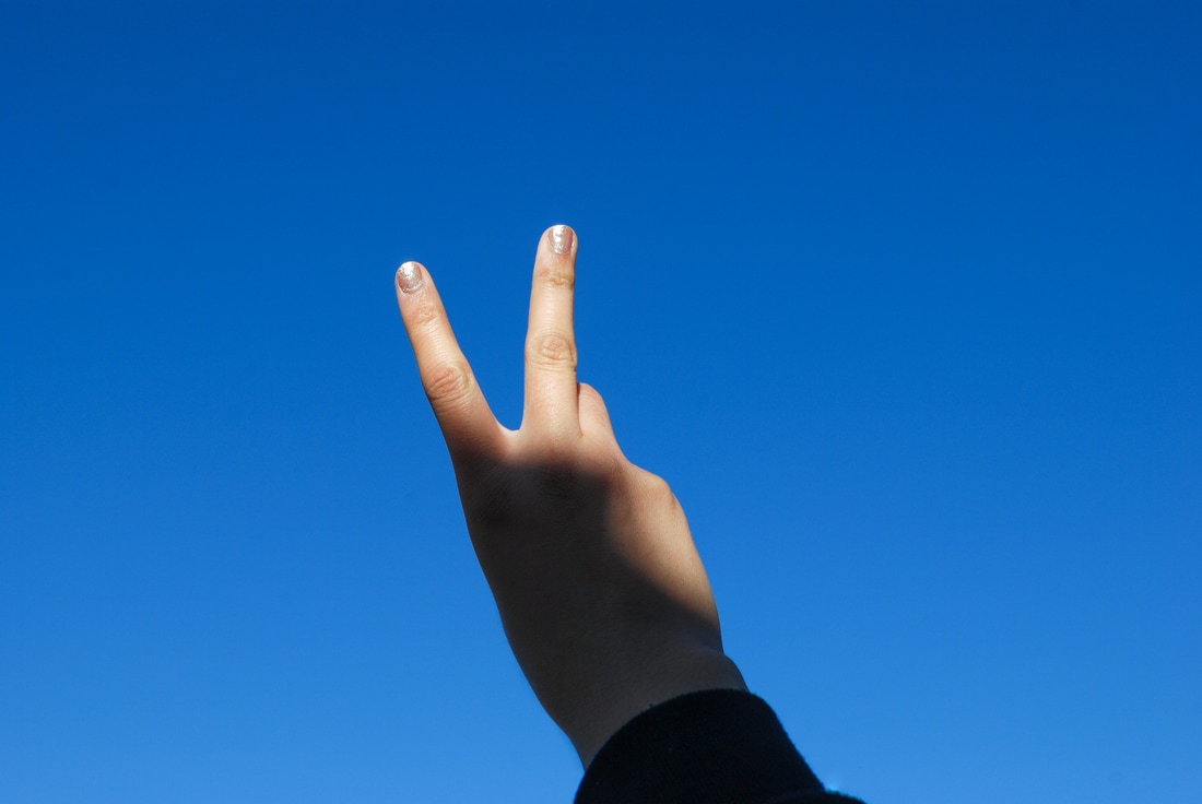
Firstly, I brought up the saturation and used the brush to change the temperature of the sky to make it more blue. I really like the shadow on the hand so I brought down the shadows and brought up the whites to really emphasize on the hand.
|
|
|
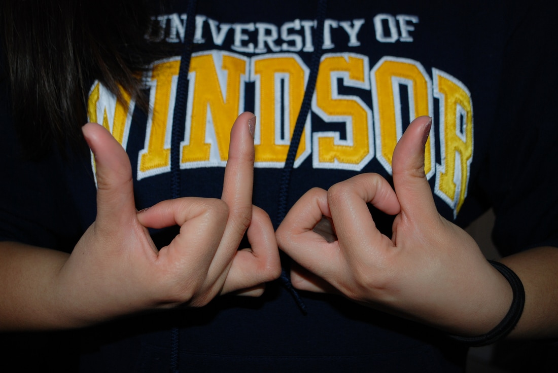
Firstly, I brought up the brightness but lowered the contrast. I also turned up the whites and lowered the blacks to really make her hands stand out from the back and from her sweater.
|
|
